Whitewashed hardwood floors are all the rage these days, but how do you style a whitewash hardwood floor without going overboard on white?
As always, here at Steller Floors, we're here to make your flooring project easy - from shopping, to installation & care, to styling!
In this blog post, we are going to share a few of our Steller whitewash flooring options, and use them as examples to discuss how to use online tools to find complementary paint and furniture colors to add to your own interior designs.
 Below we list a few really fun, free, and accessible tools for all of us hobbyists who are contributing to our own interior designs.
These tools aren't exactly going to get results for the ultra-modern, professional styles like Kim & Kanye or Beyoncé & Jay-Z ;). But, if you do have additional ideas for how to amp up your own interior designs and get extra fancy, please include them in the comments!
Why are whitewash wood floors so popular?
Real hardwood floors are the undisputed king of flooring and will remain so. Most Americans see their home as an investment vehicle, and in 2022 the National Remodeling Impact Report found that new hardwood floors returned 118% of their value on upon sale - and that doesn't even mention the 10 out of 10 Joy Scores for homeowners.
Trend Seekers Anon: And, while homeowners clearly love natural grain patterns and the rugged, long-lived value of hardwood floors - in our experience, most folks don't personally care about the trends. However, homeowners do worry about their homes appearing "too traditional" for the modern homebuyer - so they always look for ways to spruce up the traditional look of flooring.
Today, Whitewashing is very trendy, and is likely to remain so over the next decade or two - so it is a very safe choice if you are looking for a new hardwood floor. With real hardwoods, following trends is really no problem. You can choose and enjoy trendy looks as they come & go, and then refinish in the future to update your look.
What's up with Whitewash, specifically?
As we have discussed before with Steller Floors, whitewashed & bright floors help spaces feel cooler and bigger - which is very popular in the American South where summers can become unbearably hot (see: Austin, Nashville, Los Angeles). In these geographic areas, bright and cool interiors become a retreat from the oppressive heat.
In recent decades, these locales (and their interior designs) have become associated with new money wealth - and so have become more popular nationwide - and globally.
As an aside: Despite how trendy they are, we don't typically recommend very bright flooring in northern climates. In the winter, it can make your whole home feel like a snowdrift. Instead, consider warmer traditional finishes or Mid-tones to keep your space feeling cool in the summer, but cozy when you need it.
Now, what to do with all that White?
Once you've settled on the whitewashed look - great choice! Now, how will you style the whitewash you love? Everybody knows that white is already a complicated color, and once you add the complexity of woodgrain into the mix - it can make it even more complicated to decide what interior design paint, trim, furniture accents & more will complement your flooring.
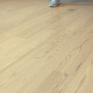
As an exercise, I have laid out samples of the four of the whitewashes we offer here at Steller Floors, shown below in springtime morning daylight.
 Start with a Snap! I snapped this photo with my cell phone, and used a simple photo editing program, like Canva, to import the photo, and I have identified the brightest mid-tone and darkest low-light colors that I could from each plank.
After I collected the Hex codes for each color (identified by "#XXXXXX"), I digitally created a triangle of that color on top of the plank.
These two colors represent the extreme ends of the range from this one tiny section of plank. Obviously, each natural hardwood floor is different, but this isn't a terrible place to get started.
As you can see, these planks are different species - including American Oak (Bristol & Newcastle), Maple (Napa), and White Oak (Nantucket) - and have different finishes to complete the whitewash look, but they end up in a similar tonal range as "whitewashes." And, in springtime daylight -which adds a golden hue simply from sun shining in the window - the difference is pretty significant.
Certainly, all four whitewashed hardwood flooring options are similar in function. They will be equally successful in brightening a room by reflecting sunlight and all will present a cooling, modern effect for any interior design. And, each one will similarly have the downfall of showing dirt more quickly than other mid-tone and dark color floors - although perhaps Napa more than all (but isn't she gorgeous?).
Yet, it is also is clear that each option will complement different wall, trim and furniture choices differently. So, let's have a look at what color science says are the ideal complements for each of our flooring options!
First, remember that these colors experience a whole range of light conditions - even at the same time of day.
At Steller Floors, we try to do our best to provide you with a digital mockup of each color variant and grain pattern as it experiences bright daylight near a window to dark shade in the corners of a room. Each of the simulations is shown for our four samples below.
As for evening lighting, unfortunately we don't know what color lighting you might choose for evenings in your home - although if you choose warm daylight - you'll make your own color coordination easier!
Let's Stop to Talk about Highlights and Sheen
Now everybody and their mother is going to put out a warrant for my arrest at this time.
But, we need to talk about sheen. You'll notice above that I picked out the mid-tone and the dark tone from the planks to use as the colors from the planks - not the highlights.
Aren't we talking about whitewashes, Britta? Give me the brights! I want to feel like I am in California!
No.
"Thou shalt not blind your guests using flooring." - Britta Teller, Steller Floors
And, believe it or not, there are two ways to ruin a great floor. (1) Using a very shiny gloss sheen that blinds guests by bouncing light directly into their eyes, or (2) using a matte sheen that diffuses light so greatly the whole surface of the wood reflects light. Both will make your floor surface difficult to look at - but for different reasons.
That's right. I said it. I have said it before, and I will say it again. Matte sheen is not a good idea. Please, do not hit me with your shoe - let me explain.
How hardwood flooring sheens are made: Flooring finishes are naturally clear and high-gloss.
Subsequently, finishes are formulated to become semi-gloss, satin, or matte by adding matting agent (typically made of silicates) which increasingly diffuse light. If four planks are finished with four different sheens, the same amount of light will hit the surface of the planks, but it will be reflected either accurately as in a mirror with a high gloss finish or very diffusely with a matte finish.
These days, in 2024, High Gloss floors are only slightly squeaking back into the corners of the fashion world - for example in Catherine Zeta Jones' recent interior design profile. More recently Beyoncé was seen on a semi-gloss chestnut-brown floor.
What? Not one noticed but me? Anyway. Here's another floor that made Bey look good. Ok I'm done.
Why are these sheens coming back? Because, when the beam of light is narrow, you can actually see the color of the floor outside the beam of light, and your eye has a place to rest- ideally on a beautiful color or grain pattern.
In our typical, middle-class, HGTV-world, matte floors are much more commonplace. These floors are lauded because they "hide dust, and dirt and scratches." But, while they're hiding dirt and scratches, the are also hiding the color and grain of your floor.
So, to meet somewhere in the middle, here at Steller Floors, we've settled on satin polyurethane for our standard options. In the future, we hope to move towards semi-gloss - simply because it looks cleaner and showcases the grain better.
So now, we can all relax, right? Great.
Finding Complementary Neutral Shades
Once you have your two main colors from your flooring sample, you can take your cues for the bright shade in your room from the highlights of your floor and the dark cues from the darkest tones.
For example, with American Oak Bristol, we will take our highlight color (#CCA67F) and our lowlight color (#BE9069) over to a complementary color tool on the web. My favorite is Color Picker by Color Kit.
Using these tools, one of the most exciting things we can do is trace the values towards white to find complementary white tones - specifically for matching white wall and trim colors.
And, we can trace lowlights down towards black to find complementary dark tones for furniture and accents. Check out the results for our four species below!
Finding Complementary Accent Colors
In a world where fast fashion and big box stores feel increasingly unsustainable and unsatisfying for completing coordinating interior designs, a key part of any interior design is knowing what colors and color families will "just fit" with an overall interior design vision.
That way you can keep particular color groupings in mind when you're at local handmade craft fairs, antique stores and furniture restoration & repair shops. From, personal experience, I can tell you that when you find that unique and meaningful piece that fits with your vision, it is significantly more valuable to your overall sense of well-being in your space than finding something that is mass manufactured, low-cost and available right now.
One tool that's really great for this exercise is the Complementary Color Picker from Giggster. In this tool I simply took the main mid-tone hue for each of the whitewashes we offer: Bristol (#CCA67F), Newcastle (#D2AA8D), Napa (#E1C9AD), and Nantucket (#B49C84) and I changed the saturation of the color by moving the cursor left and right across the page until I found a complementary color I felt out be a fun accent color for a lamp, mirror or picture frame. Then, I selected the Hex code of color that complemented the mid-tone and dumped it back in the picture in canva. Results are shown below!
It probably isn't a surprise that these whitewashes have complementary accent colors in the greenish-blue portions of the color wheel, but they are significantly different from one another as well. It is also worth peeking at these options in ColorKit as well to keep an eye out for fun complementary indoor greenery, too!
 Using this Tool The Opposite Direction
Now that you know how you can choose your accents, wall and furniture colors from your flooring, you can also see how you could also work from your wall and furniture colors backwards towards the matching flooring variety.
For example, if your style ranges from taupe to army green, Bristol could fit in quite nicely whereas if your space has lots of sandy greige tones, Nantucket can be the ideal match!
Most of all, Have Fun!
One of the great things that I like about this approach is that Color Kit suggests more colors across the spectrum than a typical white. And, if you love a tone along the complementary spectrum, but not a color - you can dig deeper to find other colors in the palette that might work for your own design.
One of the most complex parts of any interior design project - whether it is a renovation or a new build - is figuring out how to get started. Hopefully, this blog post gives you a good set of free, accessible tools and a set of ideas that help you get going and really have fun bringing your vision to reality.
Here at Steller Floors, we love when your flooring project is as easy & fun as possible! If you're looking for any input or feedback from our team, don't hesitate to reach out at 1-800-955-7671 or get started with us by Getting a Quote!


.png?width=1200&length=1200&name=Newcastle%20Matte%20by%20Steller%20(1).png)